


SIMPLY CLEVER.
After three years we’ve decided it is time to launch a new campaign and rebrand the face of Oknoplast.
Our goal has always been to innovate and create practical solutions that keep your life simple and convenient while maintaining the premium-quality, luxury look our brand name is recognized for. Keeping all this in mind we came up with the new campaign Simply Clever.
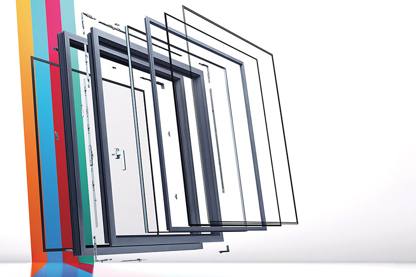
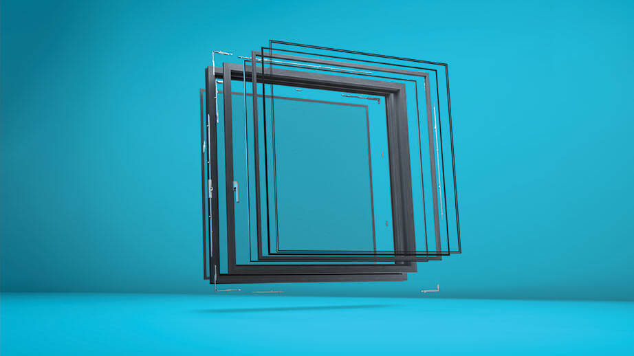
Simply Clever is comprised of four parts, each with a designated color to easily differentiate which trait of the window we are communicating.
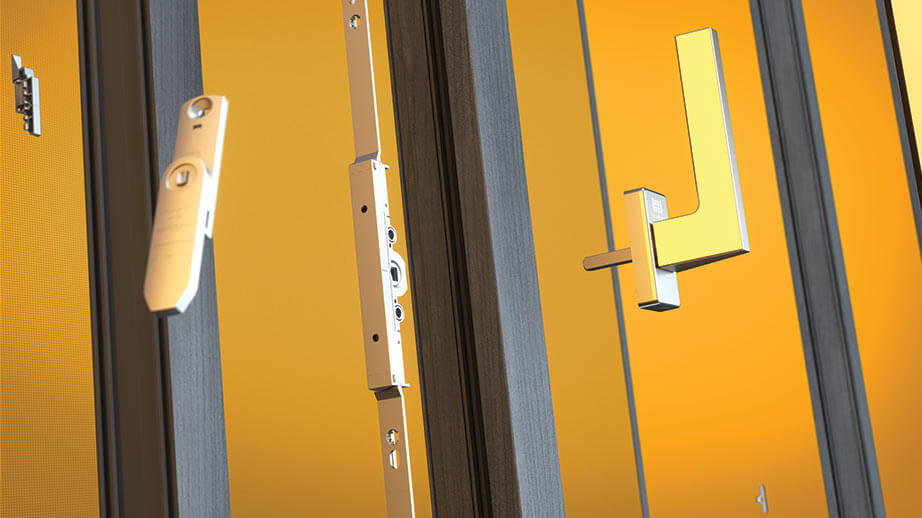
More Simple – The More Simple aspect of the campaign highlights the features of the window systems that make your life more simple. For example, how the opening mechanisms of the window facilitate cleaning and ventilation.
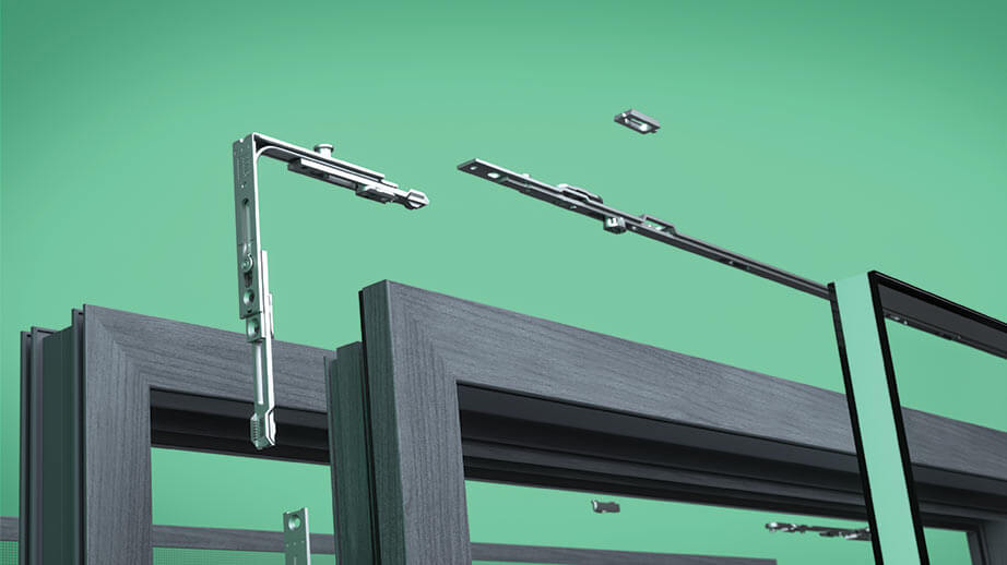
More Safe – More Safe emphasizes the qualities that ensure security in our window systems. From the window screens that protect you from insects to the handles with special blocks that prevent window falls, all the way to the materials used in the frame to create structural stability and help prevent break-ins.
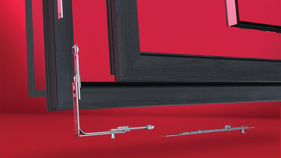
More Beautiful – The More Beautiful part of our campaign underlines the aesthetic components of our windows. Architectural design is a work of art and creating the perfect window is an important factor in that, which is exactly why we take pride in our modern design, customizable shapes, and many color options.
More Efficient – The More Efficient segment of the campaign calls attention to the efficiency of Oknoplast systems. With improved noise reduction, sun protection, low heat transfer coefficient, and sustainable development, we’ve designed top-of-the-line windows that can make your life more efficient.
COLOR.
To dive deeper into the communication behind the campaign, we used color psychology to support each of the four campaign parts. For More Simple, we chose the color yellow, as yellow is often thought of as a friendly color. Knowing this, we chose yellow to help communicate that our windows are user-friendly and allow for a simple experience. We chose the color green to represent the More Safe subsection of our campaign. Green has been globally recognized as the color for safety in both industrial facilities and everyday life, so it was only appropriate to communicate the safety of our windows through the color green. Red is bold and the color of confidence, which is why we chose it to emphasize the More Beautiful part of our campaign. Our windows are fully customizable to fit any aesthetic because we know that beauty and confidence come in all colors, shapes, and sizes. The last component of our campaign is More Efficient, which is communicated through the color blue. Blue is an intellectual color representing trust, logic, communication, and efficiency, which made it the perfect candidate to help us communicate how efficient our windows truly are. Colors play an important psychological role in communication, so we used them to our advantage in order to help you understand our new strategy as simply as possible.


Let’s talk about your project!
Request a quote, discuss specifications, or get help choosing the right system
Send a request
"*" indicates required fields