


Best exterior colors for black window frames

Key Takeaways:
- How black Oknoplast PAVA and PIXEL uPVC frames hold a UV-stable finish across all four US climate zones, resisting fading and warping regardless of exterior color pairing
- How siding undertone – cool white, gray, or navy versus warm cream, beige, or terracotta – determines whether black frames read as maximum contrast or need a bridging trim color
- How black frames function as a two-tone facade’s visual bridge, with slim PAVA and PIXEL sightlines concentrating that contrast into a precise architectural line rather than a heavy border
- How eight architectural styles – modern farmhouse, Craftsman, contemporary, industrial, coastal, Tudor revival, Mediterranean, and mid-century modern – pair naturally with black frames, while Victorian and traditional colonial do not
- How anthracite, Oknoplast’s near-black finish with a subtle warm undertone, bridges the gap between true black and bronze framing on warm-toned facades
- How coordinating front door, trim, gutter, shutter, and roofline colors around black frames avoids the most common exterior color mistakes, from undertone clashes to visual heaviness
What Exterior Colors Pair Best with Black Window Frames?
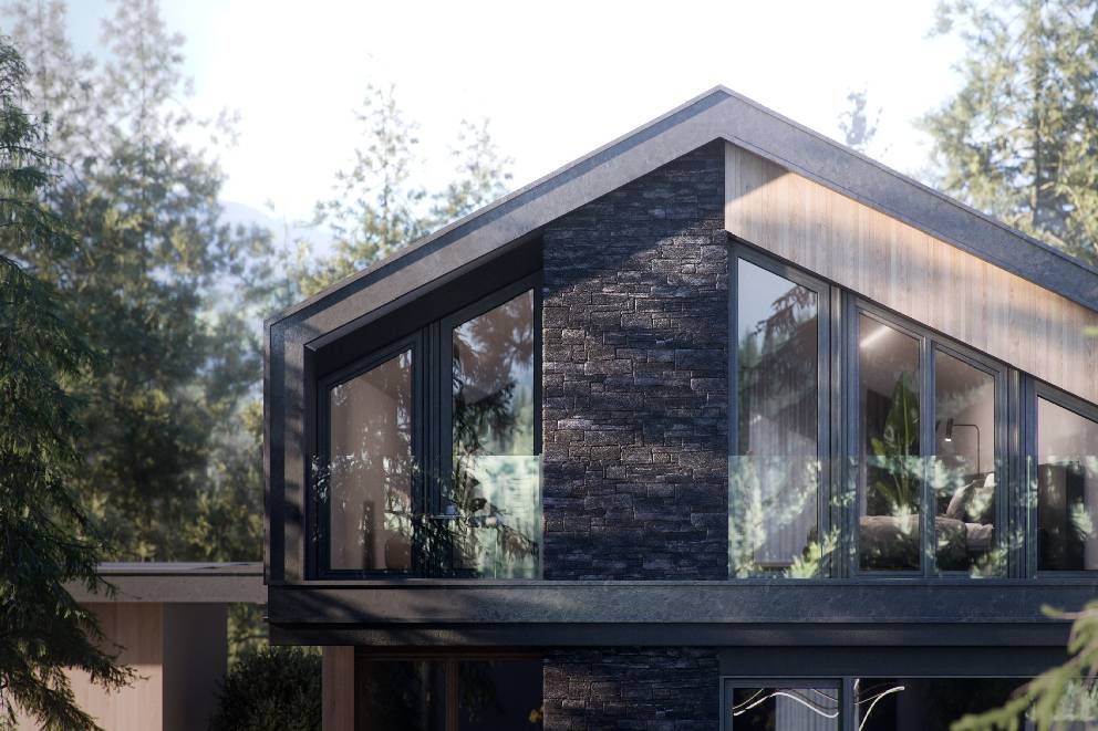
Black window frames are remarkably versatile – they work beautifully with white and cream siding for that striking farmhouse contrast, pale gray for a polished contemporary look, charcoal and slate for moody monochromatic drama, navy and forest green for Craftsman richness, warm earthy tones for a softer transitional feel, and natural stone or exposed brick for an industrial, material-driven aesthetic. Oknoplast.us PAVA and PIXEL uPVC frames hold their black finish reliably across all four US climate zones, resisting both fading and warping.
White and cream exteriors create the boldest contrast with black frames – the sharp tonal divide is a hallmark of modern farmhouse design, instantly drawing the eye to window placement. For something more understated, pale gray and greige pairings offer a refined, lower-contrast look that suits contemporary and transitional homes where quiet curb appeal takes center stage.
Darker palettes – charcoal, slate, and navy – work differently, using black frames to build depth rather than contrast, a signature move in industrial and Craftsman-adjacent design. Forest green and sage exteriors take a similar approach, letting the dark frames reinforce an organic, nature-connected aesthetic. Warm tones like beige, taupe, and terracotta strike a middle ground, softening the frame-to-siding contrast into something approachable and grounded.
Exposed brick and natural stone are particularly well-suited to black frames. The flat, dark finish of Oknoplast.us PAVA and PIXEL uPVC profiles plays off rough masonry surfaces as a textural counterpoint – no paint decisions required, just clean material contrast.
There’s also a practical upside: black frames hide dirt, dust, and water streaks far better than white profiles, meaning fewer cleaning cycles and less visible wear over time.
| Exterior Color Category | Specific Colors | Visual Effect | Best Architectural Style |
| White / Cream | Bright white, off-white, cream, ivory | Maximum contrast, bold frame definition | Modern farmhouse, transitional |
| Pale Gray / Greige | Light gray, greige, warm stone gray | Refined contrast, understated elegance | Contemporary, transitional |
| Charcoal / Slate / Navy | Charcoal, slate, dark navy blue | Dark monochromatic depth, moody drama | Industrial, Craftsman, contemporary |
| Warm Earthy Tones | Beige, taupe, terracotta, warm sand | Softened contrast, grounded warmth | Farmhouse, transitional |
| Green / Natural Materials | Forest green, sage, exposed brick, natural stone | Nature-forward texture contrast | Craftsman, industrial, rustic |
Beyond aesthetics, black is arguably the smartest long-term frame color choice. Oknoplast.us PAVA and PIXEL steel-reinforced multi-chamber uPVC profiles maintain their finish without color degradation – so whether a homeowner repaints in five years or twenty, black frames adapt effortlessly to new palettes, making them the lowest-risk option for resale value and repainting flexibility across every US climate zone.
How Do White, Cream, and Pale Gray Siding Create High-Contrast Exteriors with Black Window Frames?
White siding delivers the sharpest contrast against black window frames, turning each window into a bold architectural statement. Cream softens this dynamic into something warmer and more transitional, while pale gray and greige dial it back further – still maintaining definition without the graphic punch. Slim Oknoplast PAVA and PIXEL profiles make the most of these light backgrounds, their narrow sightlines letting the frame read as a precise design line rather than a heavy border.
White Siding: Maximum Contrast and Modern Farmhouse Signature
Nothing beats white siding for raw contrast – black window frames pop against a bright white facade, functioning as crisp graphic lines that anchor every opening. This is the signature look of modern farmhouse design, where black trim transforms windows into the dominant feature of the exterior. Board-and-batten amplifies this further; its vertical panel geometry echoes the frame lines, sharpening the overall composition. White also offers the broadest trim flexibility, pairing cleanly with virtually any accent color.
Cream Siding: Warmer Tone for Transitional and Colonial Styles
Cream pulls back from the starkness of pure white while keeping the architectural clarity that black frames provide – making it a natural fit for transitional and colonial-style homes. The warm undertone nudges the palette toward a softer farmhouse feel without sacrificing contrast. When choosing trim, stick to warm whites or natural wood; cool gray trim tends to clash with cream’s undertone, disrupting the facade’s cohesion.
Pale Gray and Greige: Contemporary Elegance with Complex Material Palettes
Pale gray and greige take contrast down another notch, though black frames still deliver strong architectural definition – making this combination well-suited to contemporary homes layered with stone accents and wood details. Gray’s neutrality makes it the most flexible option for multi-material facades, working with white, charcoal, or warm wood trim alike. Rather than graphic boldness, this pairing produces a refined, understated elegance that suits modern curb appeal.
Siding Material Quality Behind Black Frames
The siding surface itself matters as much as the color. Fiber cement holds a crisp, consistent finish that lets black frames read cleanly against the facade, while vinyl can introduce sheen variations that soften – and weaken – the contrast effect. For high-contrast black and white exteriors, fiber cement is the preferred substrate.
Slim Oknoplast PAVA and PIXEL Sightlines on Light Siding Backgrounds
Oknoplast’s PAVA and PIXEL profiles are built around slim sightlines that maximize visible glass – on white, cream, or pale gray siding, this means the frame registers as a thin, intentional line rather than a bulky border. Against light backgrounds, that narrow profile concentrates the visual impact of black trim into a precise architectural accent, reinforcing the graphic clarity central to both modern farmhouse and contemporary exterior design.
| Siding Color | Contrast Level | Best Trim Color | Best Architectural Style |
| White | Maximum | All trim colors | Modern farmhouse, board-and-batten |
| Cream | Moderate-High | Warm white, natural wood | Transitional, colonial |
| Pale Gray / Greige | Moderate | White, charcoal, warm wood | Contemporary, mixed-material facades |
How Do Charcoal, Slate, and Navy Exteriors Create a Monochromatic Look with Black Window Frames?
Charcoal, slate, and navy are three dark tones that pair naturally with black window frames to create a seamless, monochromatic exterior. Rather than relying on color contrast, these schemes draw visual interest from material texture – think rough board-and-batten against smooth fiber cement, or stone accents beside painted siding. That said, some form of accent relief (a white trim surround, a light entry door, or a wood panel) is essential to keep the facade from feeling oppressive. Oversized windows with slim black frames take this aesthetic further, reading as dramatic open voids cut into the dark envelope.
Charcoal gray siding pushes the monochromatic concept to its logical extreme – frames and siding merge into a single dark mass, leaving texture as the only means of differentiation. Slate introduces a subtle shift, either slightly warmer or cooler than true gray, which adds perceptible depth while preserving tonal cohesion. Navy blue ventures beyond strict neutrals but stays firmly within the dark palette; black frames anchor the facade without competing chromatically, keeping the overall composition unified rather than busy.
Every dark monochromatic exterior benefits from at least one well-placed relief element – a light entry door, white window trim, natural wood paneling, or a contrasting metal roof. Positioning this accent at the facade’s focal point, typically the entry zone or ground-floor window band, delivers maximum visual impact without undermining the scheme’s tonal discipline.
Window scale plays its own role in the overall effect. On contemporary flat-roof homes especially, large windows with slim black frames seem to dissolve into the dark facade, creating the kind of gallery-like, void-heavy aesthetic that defines modern residential design at its most striking.
Oknoplast PAVA and PIXEL windows feature a UV-stable black finish that holds consistent color across every unit – a critical detail for monochromatic facades, where even slight variation between individual frames can undermine the tonal uniformity the design depends on.
| Siding Color | Frame Relationship | Required Accent Relief | Best Architectural Style |
| Charcoal Gray | Near-identical tonal match – frames and siding merge into unified dark envelope | White trim surround or light entry door | Contemporary flat-roof, modern farmhouse |
| Slate | Slight tonal variation (warmer or cooler gray) – maintains monochromatic cohesion with added depth | Natural wood accent panel or metal roof in contrasting tone | Transitional, Scandinavian-inspired |
| Navy Blue | Chromatic but dark-palette consistent – black frames anchor navy without competing | Light entry door or white window trim surround | Coastal contemporary, craftsman modern |
How Do Warm Earthy Tones and Natural Materials Complement Black Window Frames on Craftsman and Farmhouse Homes?
Warm earthy tones – beige, taupe, terracotta, exposed brick, natural stone, cedar, forest green, and sage – work beautifully alongside black window frames, offering an organic backdrop that transforms the dark frame into a striking modern accent. This pairing is essentially the signature of Craftsman and modern farmhouse design, where textural contrast and material authenticity drive the entire aesthetic.
Beige and taupe siding serve as quiet, warm-neutral foundations that let black frames register as deliberate architectural statements rather than the dominant design element. Their low chromatic intensity keeps the facade grounded, while the black frame introduces structural definition – preventing the exterior from feeling flat or visually undifferentiated.
Exposed brick in warm red, buff, or brown tones creates a historically resonant pairing, as the dark frame naturally echoes both the iron oxide tones within the brick and the shadow lines of mortar joints. Rather than feeling like a cosmetic addition, black frames take on genuine architectural authenticity against Craftsman and industrial-era facades.
Warm-undertone limestone and sandstone gain a sharp, modern edge when black frames are set against their rough texture – updating a traditional stone exterior without compromising material integrity. Cedar siding tells a similar story: its warm orange-brown tone produces an effortlessly rustic-modern combination with black frames, making it a natural fit for farmhouse and transitional styles alike.
Forest green and deep sage green each bring something distinct to the pairing. Forest green creates a nature-forward, anchored palette where black frames define the composition, while the more subdued sage green actually relies on those dark frames to keep the tone from appearing washed out in natural light. Both align with the Craftsman ethos of material honesty – every element, including the frame, is a visible and intentional presence.
There’s also a practical side worth noting: dark frames conceal dirt, stone dust, and wood debris far more effectively than white frames, reducing the visible effects of weathering on facades where brick, stone, and cedar regularly generate particulate residue.
| Material / Color | Undertone | Effect with Black Frames | Architectural Style |
| Beige / Taupe Siding | Warm neutral | Black frame reads as bold architectural accent; facade stays grounded | Craftsman, Modern Farmhouse |
| Exposed Brick | Warm red / buff / brown | Black frame echoes mortar joints and iron tones; historically authentic pairing | Craftsman, Industrial-era |
| Natural Stone | Warm limestone / sandstone | Crisp contrast against rough texture; modernizes traditional stone facade | Craftsman, Traditional |
| Cedar Wood Siding | Warm orange-brown | Rustic-modern pairing; black frame anchors the organic wood tone | Farmhouse, Transitional |
| Forest Green / Sage Green | Earthy green (deep or muted) | Forest green: anchored, nature-forward; sage green: black frame prevents washed-out appearance | Craftsman, Modern Farmhouse |
How Do Two-Tone Siding Combinations Accentuate Black Window Trim?
Two-tone siding combinations use black window frames as the visual bridge between two distinct siding colors. Common approaches include white upper/charcoal lower, cream primary/deep green accent, and pale gray/black secondary elements. Oknoplast PAVA and PIXEL profiles deliver a consistent black finish across every frame component – fixed, operable, and mullion – so the accent system reads as unified across both color zones.
Two competing siding colors naturally create visual tension without a unifying element to anchor them. Black window trim resolves that tension by appearing in both zones simultaneously, making the color choice feel intentional rather than accidental. The result is two separate color fields functioning as one coordinated exterior design – something that’s difficult to achieve without a shared accent like black trim running throughout.
The classic proportion rule places the lighter siding in the upper field and the darker shade below. The lighter zone recedes visually, lending the structure height, while the darker lower band grounds it. Black window trim works seamlessly in both fields – it neither clashes with charcoal lower siding nor competes with white upper siding, making it uniquely suited to bridge both zones without any adjustment.
Gable-end configurations amplify this effect at a key architectural focal point. A darker gable set against a lighter primary wall concentrates visual weight near the roofline, and black frames at gable windows integrate naturally into that field – reinforcing the accent system exactly where curb appeal matters most.
Tonal consistency across all frame components is non-negotiable with Oknoplast PAVA and PIXEL profiles, especially on two-tone facades where every fixed lite, operable sash, and mullion is visible across multiple color zones. Even slight variations in black depth or surface finish break the visual bridge – the accent system must read as one cohesive color, not a collection of near-black approximations.
| Two-Tone Configuration | Upper Siding | Lower/Accent Siding | Black Frame Role |
| White upper / Charcoal lower | White board-and-batten | Charcoal lap siding or shiplap | Threads through both zones as the shared accent element, preventing color conflict at the transition line |
| Cream primary / Deep green accent | Cream primary wall field | Deep green gable, dormer, or lower band | Creates visual consistency between warm cream and cool green fields – the black trim color is neutral to both hues |
| Pale gray primary / Black secondary | Pale gray primary wall | Black shutters, gable, or window reveals | Integrates directly with black secondary elements to form a cohesive accent system across the full color scheme |
Each configuration above calls on black window trim to perform a distinct bridging function. In the pale gray/black pairing, Oknoplast black frames go beyond mere complementing – they become tonally identical to the black secondary siding elements, effectively dissolving the line between window frame and architectural accent into one seamless exterior design system.
See the products
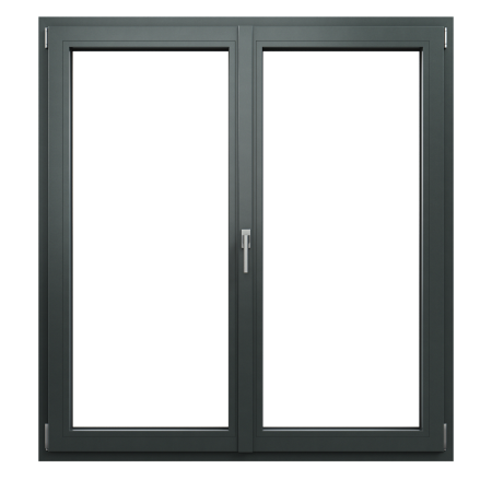
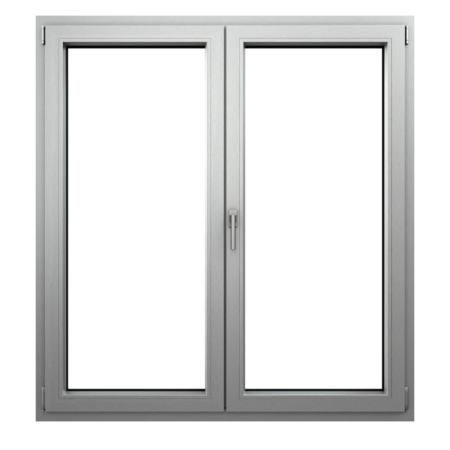
Which Architectural Styles Are Best Suited to Black Window Frames?
Black window frames pair best with eight architectural styles: modern farmhouse, Craftsman, contemporary/modern, industrial, coastal, Tudor revival, Mediterranean, and mid-century modern. Victorian and traditional colonial sit at the opposite end of the spectrum – their ornate polychrome details and long-standing preference for lighter finishes make black frames a poor fit.
Eight Architectural Styles Where Black Window Frames Perform Best
Modern farmhouse exterior design is the definitive pairing: white board-and-batten siding against black frames is the style’s signature look, delivering the kind of bold contrast that no other frame color can replicate.
Craftsman homes typically feature deep earthy tones – greens, browns, and blues – where black frames quietly reinforce wide eaves, tapered columns, and porch detailing rather than competing with them. The dark frame reads as a structural accent that speaks the style’s handcrafted material language.
Contemporary and modern design leans on dark monochromatic or high-contrast minimalist palettes, flat rooflines, and expansive glazing – conditions where black frames become a primary compositional element rather than a decorative trim detail.
Industrial exteriors – exposed brick, steel accents, charred wood – build a raw material palette that black frames naturally echo. Here, the frame color becomes part of the material story rather than simply a contrasting feature.
Coastal and Cape Cod homes with white or pale blue siding gain a nautical crispness from black frames, a combination that feels deliberate rather than stark. Mid-century modern architecture, with its love of strong material contrast and clean horizontal lines, makes black frames an equally natural fit for the style’s geometric sensibility.
Tudor Revival and Mediterranean: Specific Material Context
Tudor revival has a built-in affinity for black frames – half-timbering, the style’s defining exterior feature, already establishes dark tones as the structural color of the facade. Black frames align with that timber framing rather than fighting it, creating visual coherence across the entire exterior. Oknoplast PAVA and PIXEL profiles in black uPVC can be fabricated in pointed arch and trapezoidal shapes, accommodating Tudor’s characteristic non-rectangular openings within a single profile family.
Mediterranean homes follow a different logic. Stucco in terracotta, warm cream, and ochre creates a traditionally warm palette where black frames introduce a modern accent without disrupting the exterior’s overall color temperature. For arched openings, Oknoplast PAVA/PIXEL custom arched shapes deliver the same black uPVC profile in curved geometry – keeping design consistency across both rectangular and non-rectangular windows.
Less-Suited Styles: Victorian and Traditional Colonial
Victorian architecture’s layered polychrome details – multiple trim colors, decorative brackets, patterned siding – clash with the graphic weight of black frames, generating visual noise rather than purposeful contrast. Traditional colonial exteriors have an equally strong case against them: white frames are the historically appropriate choice, and black alternatives read as anachronistic against symmetrical clapboard and classical proportions.
| Architectural Style | Typical Siding / Exterior | Black Frame Role | Oknoplast Recommendation |
| Modern Farmhouse | White board-and-batten | Definitive contrast pairing – signature aesthetic | PIXEL flat-profile in black uPVC, rectangular openings |
| Craftsman | Deep greens, browns, blues | Structural accent reinforcing handcrafted details | PAVA black uPVC, standard rectangular casement |
| Contemporary / Modern | Dark monochromatic or high-contrast cladding | Primary compositional element in minimalist palette | PIXEL large-format black uPVC for expansive glazing |
| Industrial | Exposed brick, steel, charred wood | Echo of raw material palette – frame as texture | PAVA black uPVC matching steel accent tones |
| Tudor / Mediterranean | Half-timber + stucco (terracotta, ochre, cream) | Tudor: aligns with dark timber; Mediterranean: modern accent on warm stucco | PAVA/PIXEL custom arched and trapezoidal black uPVC shapes |
Should You Choose Black or Bronze Window Frames for Your Exterior Palette?
Black frames deliver maximum contrast and crisp architectural definition, making them ideal for cool-undertone palettes – while bronze offers warm, seamless integration with natural material facades. In terms of staying power, black carries a 15+ year trend record compared to bronze’s shorter residential history.
When it comes to contrast, black window frames sit at the top of the scale, making them the go-to for contemporary, modern farmhouse, industrial, and coastal styles. Their cool-neutral boldness reads sharply from the street, giving any home a stronger curb presence. Bronze takes a quieter approach – its lower contrast lets the frame recede into warm-toned facades rather than compete with them, a technique known as refined integration.
The most reliable decision framework comes down to undertone: cool exteriors – think cool white, gray, slate, or navy – pair naturally with black, while warm surfaces like cream, beige, terracotta, or red brick can work with either, depending on whether you want definition or harmony. Craftsman, Mediterranean, transitional, and traditional styles have a natural affinity for bronze, echoing the period iron hardware these architectures historically reference.
Oknoplast’s PAVA and PIXEL lines give you room to fine-tune this decision, offering both true black and anthracite – a near-black finish with a subtle warm undertone. For warm-toned facades where full-contrast black feels too stark, anthracite bridges the gap between the two options elegantly.
Maintenance is worth considering too. Black frames are better at hiding dust, pollen, and everyday grime, while bronze’s warm metallic surface can make light-colored debris more visible. That said, both finishes are factory-applied to uPVC, meaning neither will ever need repainting.
| Decision Factor | Black Frames | Bronze Frames | Choose If… |
| Contrast Level | Maximum – sharp architectural definition | Lower – refined integration with facade | Maximum contrast → black; integration → bronze |
| Undertone Alignment | Cool and warm exteriors alike | Warm-undertone exteriors only | Cool-undertone palette → black; warm-undertone → bronze |
| Architectural Style | Contemporary, modern farmhouse, industrial, coastal | Craftsman, Mediterranean, transitional, traditional | Match style to corresponding frame tone |
| Trend Longevity | 15+ year demonstrated durability | Emerging – shorter residential track record | Long-term design confidence → black |
| Dirt Concealment | Conceals dust and pollen effectively | May show light-colored debris on warm finish | Low-maintenance exterior design → black |
There are three scenarios where bronze genuinely outperforms black: a warm red-brick Craftsman facade where high contrast would feel visually jarring, a Mediterranean stucco exterior in terracotta or ochre tones, and a transitional home where frame-to-facade harmony matters more than bold definition. Beyond these warm-undertone cases, black remains the more versatile and trend-resilient choice across the widest range of exterior palettes.
How to Coordinate Doors, Gutters, and Trim with Black Window Frames?
Pulling together a cohesive exterior around black window frames comes down to five key decisions: your front door (match it in black for a unified look, or go bold with a contrasting color), trim (bright white delivers the sharpest contrast), gutters (stick with black aluminum or white – mismatched metals are a problem), shutters (black-on-black gets heavy fast, so choose a contrasting color or skip them entirely), and the roofline (dark roofs harmonize, light ones contrast).
Front Door Options with Black Window Frames
A black front door alongside black window frames creates a bold, graphic statement – ideal for contemporary or modern farmhouse exteriors that lean into a strong architectural identity. If that feels too uniform, a contrasting color like deep navy, forest green, or rich red turns the door into a deliberate focal point, while the black frames hold the facade together as a consistent dark framework. It’s a more layered approach that adds visual interest without sacrificing coherence.
Trim Color Selection
Nothing maximizes curb appeal with black frames quite like bright white trim – it produces the highest contrast ratio of any option and is the go-to choice for a reason. Cream, by contrast, dulls that sharpness and can actually clash with the intensity of black. If your siding runs warm or cream-toned, warm white or natural wood trim is a smarter pick, preserving the visual separation between frame and trim without the color conflict. That distinction between bright white and cream matters more than most people expect.
Gutters and Downspouts
Black aluminum gutters tied to black window frames pull every linear element into a single, coordinated system – a clean and deliberate exterior strategy. White gutters against white trim offer a safe, equally polished alternative that keeps things visually clear. Bronze, however, introduces a metallic clash that doesn’t sit well with black frames and is best avoided. Whatever you choose for the gutters, keep the downspouts consistent – mixing finishes between the two is one of the easiest ways to undermine an otherwise resolved exterior.
Shutters and Railings
Pairing black shutters with black frames is the most common mistake in this color scheme – the result feels heavy and the facade loses definition. Deep green, navy, or simply leaving shutters off altogether are far better paths. On porches and balconies, black railings integrate naturally with the frames, while wrought iron with a natural patina offers something slightly different – close to black but not identical, adding a layer of material richness to the overall palette.
Roofline Coordination
A dark roof – charcoal asphalt shingles or dark metal standing seam – ties into black window frames by wrapping the exterior in a cohesive, tonal architectural envelope. A light roof, whether white metal or light gray, takes the opposite route, creating deliberate high contrast rather than harmony. Neither is wrong; it simply depends on whether you’re designing toward unity or tension at the roofline.
| Exterior Element | Match Black Frames | Contrast with Black Frames | Avoid |
| Front Door | Black (graphic unity, contemporary) | Deep navy, forest green, rich red (accent point) | Beige or pale neutrals that lack definition |
| Trim | – | Bright white (maximum contrast) | Cream (reduces contrast, clashes with black) |
| Gutters | Black aluminum (fully coordinated) | White (clean, neutral) | Bronze (metallic clash with black frames) |
| Shutters | Avoid – creates visual heaviness | Deep green, navy, or omit entirely | Black shutters with black frames |
| Roofline | Charcoal asphalt, dark metal standing seam | White metal, light gray roof | Mismatched mid-tone browns that compete with frames |
Oknoplast PAVA and PIXEL windows maintain a consistent black finish across every fixed and operable frame component – meaning each window on your facade contributes uniformly to the coordinated exterior system, with no tonal variation between window types to disrupt the overall color scheme.
What Exterior Color Mistakes Should You Avoid with Black Window Frames?
Seven pitfalls consistently trip up homeowners working with black window frames: pairing warm-yellow siding without bridging trim, stacking too many dark elements with no visual relief, mismatching frame colors across different opening types, applying them to Victorian or traditional colonial architecture where they feel anachronistic, using them on small dark homes that already feel closed-off, skipping trim surrounds on masonry where frames simply vanish, and letting hardware finishes undermine an otherwise cohesive palette. Fortunately, each has a clear fix.
Undertone Clash: Warm-Yellow or Cream Siding
Black frames carry a cool undertone that actively fights warm-yellow or cream siding, producing visible tension across the entire facade. The fix is surprisingly simple – introduce warm white or natural wood trim as a bridge between the two surfaces, or shift the siding to a cooler cream that closes the undertone gap. Skip that bridge entirely and the exterior will feel unresolved no matter how carefully you’ve chosen the individual paint colors.
Visual Heaviness: Too Many Competing Dark Elements
Stack black frames with dark shutters, charcoal siding, and a black roof and you’ve left the facade with nowhere to breathe. At least one light accent – white trim, natural wood detailing, or a softer door color – needs to interrupt the darkness. Without that anchor, the look tips from bold to oppressive and any sense of architectural hierarchy disappears.
Small Homes with Dark Siding
On a compact home, dark frames combined with dark siding create a fortress effect that shrinks the perceived scale even further. Black frames genuinely work on smaller houses, but only when the siding is light enough for the contrast to read as definition rather than compression. Pair both dark elements on a tight footprint and you lose the visual expansion that light siding provides.
Missing Masonry Trim Surround
Against brick or stone, black frames without an adequate trim surround simply disappear into the wall. A 4-6 inch band of white or high-contrast trim around every opening creates the separation needed for frames to register as a deliberate design choice. On dark or variegated masonry especially, skipping this step renders the frames nearly invisible.
Hardware Palette Inconsistency
Polished chrome hardware next to black window frames is one of those combinations that looks off without the viewer quite knowing why – the cool, reflective finish clashes with the flat or satin depth of the frames. Switching to matte black or dark bronze across all entry and door hardware pulls the palette back into alignment and lets the frames read as intentional rather than accidental.
| Mistake | Why It Fails | Correction |
| Yellow Siding Undertone Clash | Cool-toned black frames conflict with warm yellow-based cream siding, creating visual dissonance | Add warm white or natural wood trim as a bridge, or switch to a cooler cream siding tone |
| Competing Dark Elements | Black frames + dark shutters + dark gray siding + black roof eliminate all visual relief points | Introduce one light accent – white trim, natural wood, or a lighter door color |
| Small Home + Dark Siding | Dark frames on dark siding on a compact home create a heavy, closed-off facade | Use black frames only on small homes with light-colored siding to preserve visual openness |
| Missing Masonry Trim | Black frames without trim surround disappear into brick or stone surfaces | Specify 4-6 inch white or contrasting trim surround on all masonry applications |
| Hardware Mismatch | Polished chrome door hardware clashes with the flat or satin depth of black window frames | Specify matte black or dark bronze hardware across all entry and door elements |
One mistake that no paint correction can fix is applying black frames to ornate Victorian polychrome facades or traditional colonial homes. The frames’ contemporary character clashes directly with period detailing, creating a stylistic conflict that sits beneath the color scheme entirely. When the architecture itself resists the choice, adjusting trim colors or siding tones won’t resolve the underlying mismatch.


FAQ
Black window frames pair especially well with white and cream for bold contrast, light gray tones for a modern look, dark shades like charcoal or navy for monochromatic depth, and warm, earthy colors and natural materials like brick or stone for a cozier effect.
Black frames effectively mask dirt, dust, and water marks, reducing how often they need cleaning. In addition, the coated uPVC profiles on Oknoplast PAVA and PIXEL windows retain their color and resist deformation across all US climate zones.
In modern farmhouse style, white facades paired with black frames create a bold, graphic contrast that emphasizes the architectural placement of the windows. Black frames act as a precise accent line around each window opening, a hallmark of this style.
Avoid pairing black frames with dark shutters, a dark roof, and a dark facade with no light accents. Introducing white trim, natural wood, or a lighter-colored front door creates visual “breathing room” and preserves a clear architectural hierarchy.
Black frames work particularly well with styles such as modern farmhouse, Craftsman, modern, industrial, coastal, Tudor revival, Mediterranean, and mid-century modern. They’re not typically recommended for Victorian and traditional colonial styles, where lighter, more ornate details dominate.
Black frames act as a visual bridge between two facade colors, such as white and charcoal, creating a cohesive, intentional composition. Thanks to the uniform black coating on Oknoplast PAVA and PIXEL windows, the frames visually tie the different color zones together without conflict.
There are two approaches: keep the door black for a cohesive, graphic look, or choose a contrasting color, such as navy, forest green, or deep red, to make the door a focal point while the black frames remain a unifying element.
Avoid pairing black frames with warm, yellow-toned facades without a bridging element like a warm white or natural wood, using too many dark elements with no light accents, and applying black frames to small, dark-colored homes, which can visually shrink the structure even further.
Let’s talk about your project!
Request a quote, discuss specifications, or get help choosing the right system
Send a request
"*" indicates required fields